We are pretty selective when it comes to featuring house tours that aren’t our own makeovers. It’s not because they aren’t all great, but more that we want you to get an important takeaway. We have a good one today:) Caitlin and I were just talking about the problem with “bitsy” wall decor. There always a place for small art when it’s done in a really intentional way, but often, art that’s too little (or bitsy) looks a bit haphazard or cluttered when multiple are hung together…and probably a reason why you my feel that your space does feel “done” or “elevated”. It’s all about scale, people! You need more large scale art. So when we were pitched this STUNNING home tour, which we actually linked up last September, we thought it very much deserved another look and deep dive. The scale of the wall art chosen REALLY shows the power of larger art and perfectly illustrates what Caitlin and I talked about. Also, the internet moves on so fast, and when a home is this special, we want to slow it down a little and appreciate it.
You might be thinking, “Ya, of course we want bigger art, but it’s really expensive!” And to that I understand, but I also know that with a little creativity, you could make or find pieces that are larger (or you could also put a small piece in a much larger frame…see a little creativity).
Now, let’s take a minute to enjoy this INCREDIBLE ceramic installation by the one and only Ben Medansky (remember when we shot his home?). The insane texture and modern aesthetic contrast in such a cool and beautiful way with the more “traditional” and “refined” design elements. Actually, the mix of the primitive bench with the modern stone pedestal table (we love pedestal tables:)), then the woven basket with the sculptural vase — perfect tension that gives off a sense of ease. But now imagine a gallery wall of a bunch of small pieces of art. Could it be pretty? Done well, of course. But likely it would look a little overwhelming. This one large piece lets your eye take a break.


Here you can see how the entry piece works with the living room piece, and boy, it’s awesome. That framed tapestry was probably not inexpensive, but I do think that with some DIY skills, someone could take inspiration from this and create a piece that’s in the same world. While it may take some time, search the internet, go to flea markets, and/or estate sales, and/or thrift stores, to find your own tapestry for a price you are willing to spend. Then you can either have it hang from something like a quilt hanger or even build your own frame. Here’s a post with other non-traditional framing options.
But what I really want to emphasize is the scale. It takes up almost the entire wall and looks insanely elevated. But you don’t have to choose a huge wall to do this. Remember the airplane photo from Emily’s best friend’s living room? The wall was much smaller, but the impact was similar.

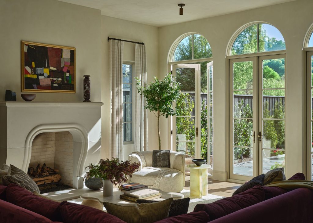
I also don’t want you to think I am suggesting that you should only use HUGE pieces that fill up entire walls. Take this beautiful and colorful abstract over the fireplace. Wait, let me first gush over the style variation between the pieces in this home. They are unexpected together but work completely harmoniously. It’s a fun surprise around every corner! Ok, back to business. This piece isn’t huge, but the scale and boldness of color are perfect. If this painting were 25% smaller, it would look a little too bitsy. And if you want to know the art resource, they got this piece from Eneby Home🙂


Another masterpiece, and I’m not just talking about the art. That wine-drenched room made my heart stop when I first saw it. Plus, the textures and shapes could not be more inviting. I imagine you feel completely transported when you are in there. Now, that piece of art is actually a tapestry that homeowner and designer, Pierce Jordan, got from his grandmother, who bought it in Paris in the 70s. What a dream! Again, something like this could easily live in your home with some vintage hunting. The added bonus is that you don’t have to pay for a frame. All you need is a cool rod.
I do want to point out that this, more detailed/ornate, rod works so well because it complements the darker wall color (aka doesn’t stand out too much), and there are a lot of other detailed vintage pieces in the space. If you have a super modern “new” room, with not a ton of intricate detailing, I’d suggest choosing a more modern and streamlined rod. There are always exceptions, but that’s a good rule of thumb.

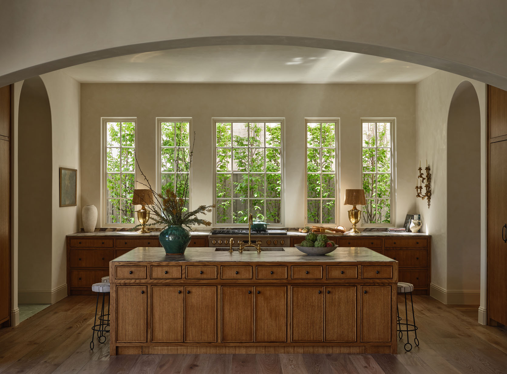
Onto this unreal kitchen. This is actually a type of room where smaller pieces can be pretty perfect. But that also depends on wall space and ceiling height. If you have a large kitchen like this one with no upper cabinets, then I would go a little bigger like they did with the piece on the left. But can we also talk about the wall sconce? WOW. Those two wall decor pieces visually balance perfectly. The scales are complementary, and since they are different types of decor, I also love that they are hung at the same height. Of course, if there were a matching sconce, then that would also be hung at the same height, but if both sides had art, they would either need to be different sizes or orientations, OR one side could have something like two pieces stacked on top of each other. Symmetry works sometimes, but variation is where that visual interest lies.


Here’s a cute little side-by-side so you can really appreciate each piece (and don’t worry, you’ll get to see both of those other rooms in a minute).

Also, before we move on, I want to point out how two different styles of cabinet fronts were chosen for this kitchen. Another great example of mixing modern and traditional. You don’t see this too often, likely because this would be an expensive regret, but clearly, if done well, it’s incredibly awesome.

Another breathtaking room? Why, yes. Please come on in. This wallpaper is art in and of itself, so to hang art on it, that art needs to be able to stand up to it visually.
Also, as a reminder, this home is a NEW BUILD. I can only imagine how much it cost, but truly, what a masterful job.


Especially with a wallpaper with this kind of pattern scale, you probably aren’t going to want to cover it with an enormous piece of art. It’s too pretty! So do like Jordan and his team did, and choose a piece that is large enough and has a presence that can stand up to the paper. Here, I think they did a perfect job by choosing a bolder, thicker frame with a still life that has texture and is a darker version of the wallpaper’s color palette.

More stunning wallpaper, please. And this color palette is both moody and inviting! Peep the ceiling:) Such a great way to connect this room to the darker living room that’s across the entryway. But the art over the fireplace is a perfect medium to large size. The darkness of the painting with the pop of colors bounces off the wood paneling while also visually standing up to the bold wallpaper. It’s so good. I mean that 1750s mantel is also a piece of art. Swoon.

This wonderful pantry doesn’t necessarily warrant a chat about big art; I just wanted to make sure you got to see it. But those two pieces are awesome together. The color palettes are similar, but the styles are very different. Couldn’t love it more. That’s how to do it, people.

I know this home is not relatable to most of us (maybe someday!), but I truly think there are so many takeaways that anyone can find. Take these two pieces of art. Beautiful, simply framed, and not small but not huge. Also, they aren’t the same size. This is very important. Unless you are creating a grid, mix up those sizes. It’s going to look more interesting and intentional.

Need I say more?? Well, unless if you can’t, you should absolutely have a piece of art in your bathroom. It looks awesome over tile, too. See an example here🙂

Couldn’t not include this bathroom. The detailing in that red travertine vanity is almost too good. I know that the mirror is on the smaller side, but doesn’t it feel so intentional? Plus, those larger linear flanking sconces really make the wall feel perfectly filled out.

I mean, sometimes all you need is a mirror:) But for me, the real star of the show is that floor!

Then, last but not least, here is an incredible special office. Every piece chosen is so special, but I’m sure you guessed that I am going to immediately talk about the art. I’m obsessed. The scale is clearly perfect. I love that it’s almost perfectly in line with the window. Also, how incredible does the height variation look? The pieces are different but talk effortlessly together, and the fact that the widths are the same, the frames are nearly identical, but the heights are varied…I’m dead. 1000/10.
I hope you were not only inspired by this home, but there were enough takeaways for you to be excited to mix up things in yours. Art should be fun, beautiful, and represent you. Maybe just go a little bigger:)
Love you, mean it.
MORE ART POST RESOURCES:
*Designed by Shane & Pierce
**Photos by Michael P.H. Clifford

