
It felt like an appropriate day to show love for what feels like the world’s most popular color – green. While I’m more of an expert in “blue,” its sister color – green – is also a favorite and beloved by most people. We know that the design world is LOVING reds, burgundies, mauves – all these warm, deep tones, but I personally still think that the right green can be both on trend and more universally loved (long term). Sherwin-Williams™ has so many different tones of greens that we’ve used over the years, many clocking in as our favorite colors we’ve ever used. So if you are wanting to paint something in your room green, these are ones I love and recommend wholeheartedly. Here we go:

Evergreen Fog SW 9130 was the Color of the Year three years ago and sure, I liked it when I saw it but it wasn’t until I painted my brother’s family room this color that I fell in LOVE. My goodness, it’s so pretty and rich – with so many different wonderful undertones that change. Sometimes it’s bluer and other times more gray, but always green for us. I will say that that room has north, south, and western light so it gets a lot (non-direct) and I’m sure that has something to do with it. Additionally, we did sample this color in Brian’s new office, which only has one small window, and in there it read mostly as gray, so it definitely changes depending on the light. You can see the difference above – Caitlin’s hallway is dark (no windows and only a few doorways), so it’s a bit cooler, whereas it’s much greener in Ken’s family room. Also sneak peek – we shot it for a big shoot, but can’t show you the whole room so stay tuned 🙂

I still absolutely love this dark, deep, almost pine green of the OG Portland project kitchen (Pewter Green SW 6208). It does have a lot of blue undertones, but remains solidly green.


I think paired with all the cooler tones of the stone and then contrasting off the wood flooring, this shade is pretty perfect. If you are scared of going too “yellow” or olive in your green, then I can solidly say this one is so beautiful and pretty hard to not love.

Rosemary SW 6187 was the winner for this kitchen’s cabinetry that we did two years ago, and while it obviously feels similar to Pewter Green SW 6208, it has a bit more warmth and “yellow” in it. We matched it to the green of the leaves in the wallpaper, which is a good hack if you are using wallpaper and want to find a paint color that will go perfectly with it.


My goodness, I love that project so much and that green is one that I’ve almost used many times since, but have opted toward some with undertones that speak to the specific project we are working on. It really does have the tone of rosemary and pairs so beautifully with brass or silver.

Heading even bluer (and possibly more forest?) we chose Rocky River SW 6215 in my brother’s mudroom. We felt that being on the river, “Rocky River” was clearly appropriate.

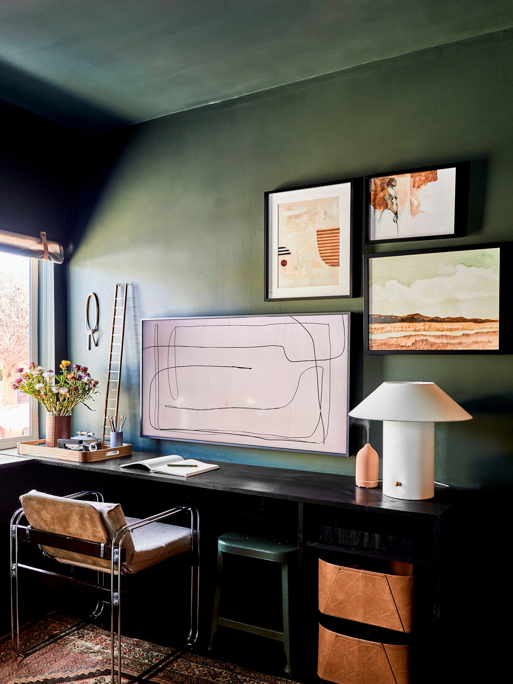
A color like this will look very dark if it were color drenched on all the walls or in a room with little natural light. However, in here it reads as a bold moody color, but still bright and fun with all the white.

This color was SO hard to choose because that Article sectional has a lot of yellow (or olive) undertones. These more olive, yellow under-toned greens are super popular right now and in this dark room it just read as warm and green (whereas in a room with a lot more natural light the yellow pigment came out more).


I LOVED this color (Mountain Road SW 7743) on these walls so much that I almost painted our front door in Mountain Road, but it pulled a lot more yellow outside so always make sure to sample on YOUR walls with YOUR light.

Emily Bowser chose Laurel Woods SW 7749 for her guestroom/office, which is what I painted the exterior of our mountain house and I LOVE it. It’s pretty dark, in a good way so be prepared for it to soak up light and be moody.

I love how Emily styled it with these deep hits of black and caramel – such a pretty color palette.


For the mountain house, I wanted something that read as “dark” but not so dark that you couldn’t tell it was green. A warning: when you are outside, the natural sunlight (even if indirect) will make the color look a lot lighter (our neighbors tried to go “dark” but didn’t choose dark enough and it’s much lighter and brighter than they wanted. So you might think you are going dark, but then in the sun it might look bright green, so err on the side of much darker if you want a medium to dark exterior.
So this color, Laurel Woods SW 7749, will read super dark inside a room without a ton of natural light (which is what Bowser wanted) and more medium/dark outside. But if you put in a room inside with a lot of natural light, the green will come out more and might be “brighter” than you might want.
I truly hope that someday technology will solve all of our paint debate issues – I would love to walk in to a room with some VR goggles so I could try different colors until my heart’s content. But for now, all you can do is go off recommendations from people who have painted a lot (like me) and then make sure to sample all the colors on different walls at different times of day and then stare at them for so long that your husband might question your sanity 🙂 At least that’s my method!
Opening Photo Image: Photo by Kaitlin Green