
I spent a ridiculous amount of time yesterday obsessing about the paint color for my walk-in closet. I studied the pictures. I tested more paint colors. I tried mixing my own custom paint colors. I looked at pictures of pink/coral closets. I looked at pictures of blue closets. I scrolled through Instagram and TikTok. I searched on Houzz. I read through all of your comments again. I clicked any links y’all provided.
I had started off the day absolutely positive that I was going to have a coral closet, and about 99% sure that I was going to choose #7, Sweet Angel. But by midday, I wasn’t even sure if I liked the coral. Basically, I was allowing myself to be influenced by each new comment that I read. And by yesterday evening, I was more confused than ever.
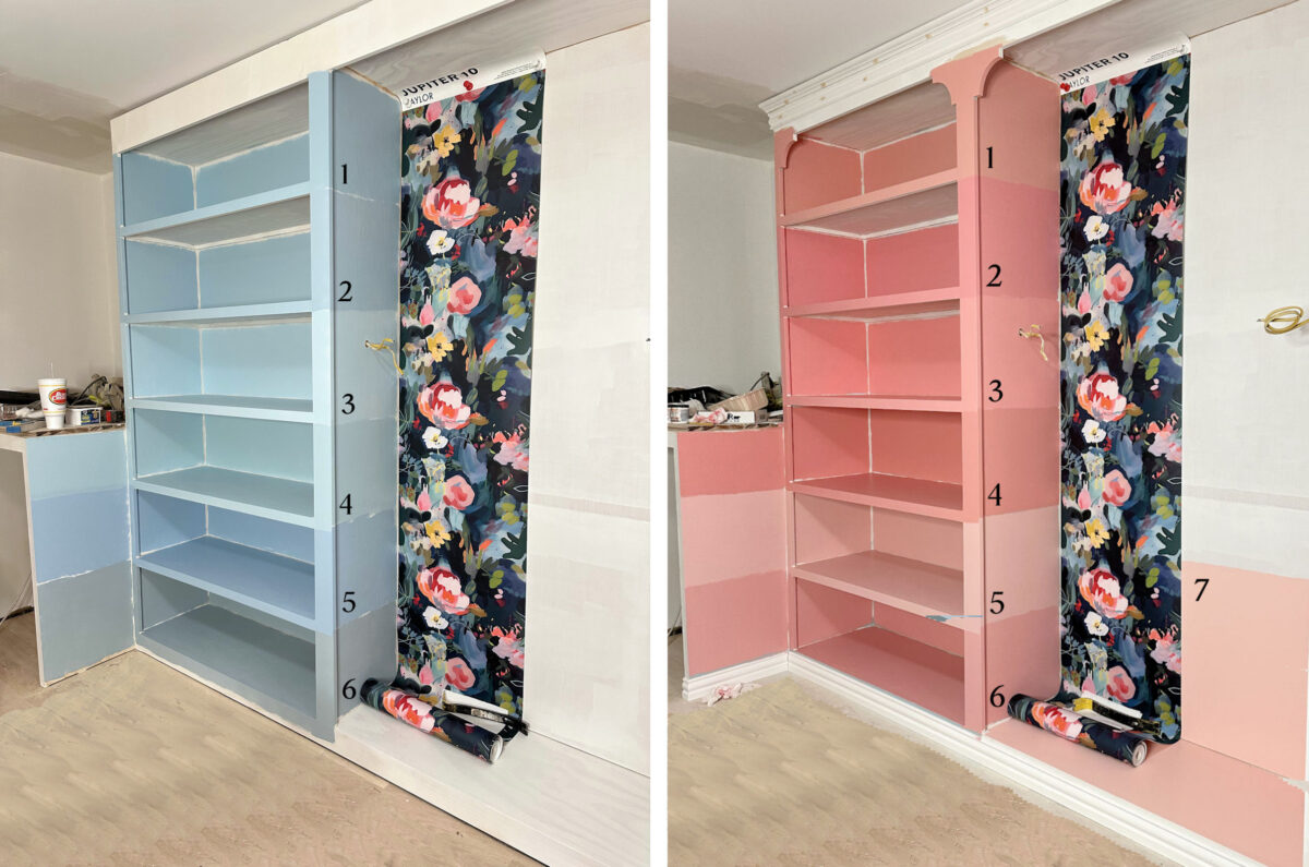
So last night, I put the two pictures together — the picture with the blue samples and the picture with the coral samples — and I edited the floor so that the dark floor wouldn’t be a distraction.
After spending a lot of time late last week obsessing about the floor color, I had already made that decision, and I had ordered the products. After scrolling Instagram and TikTok looking at all of the red oak floors finished with Bona products that I could find, I had decided to use Bona Red Out on my floor, seal with Bona Natural (the second from the lightest), and then use Bona TrafficHD. Every single time I would see a red oak floor that I loved, I would read the description and find that they had used the Bona Natural on those floors. And one TikTok in particular sold me on using Red Out first. So I went with it.
Here’s a great example of Bona Natural on red oak, but this is only one of many that influenced my decision.
So with my flooring in mind, I tried to put all of the noise and clutter out of my head, and just let myself make a genuine, honest decision based on my own likes and wants with no outside influence. Without anyone else’s influence, do I like the blue or the coral better?
I know I’m going to shock you, and probably disappoint at least half of you, but I actually like the blue better.
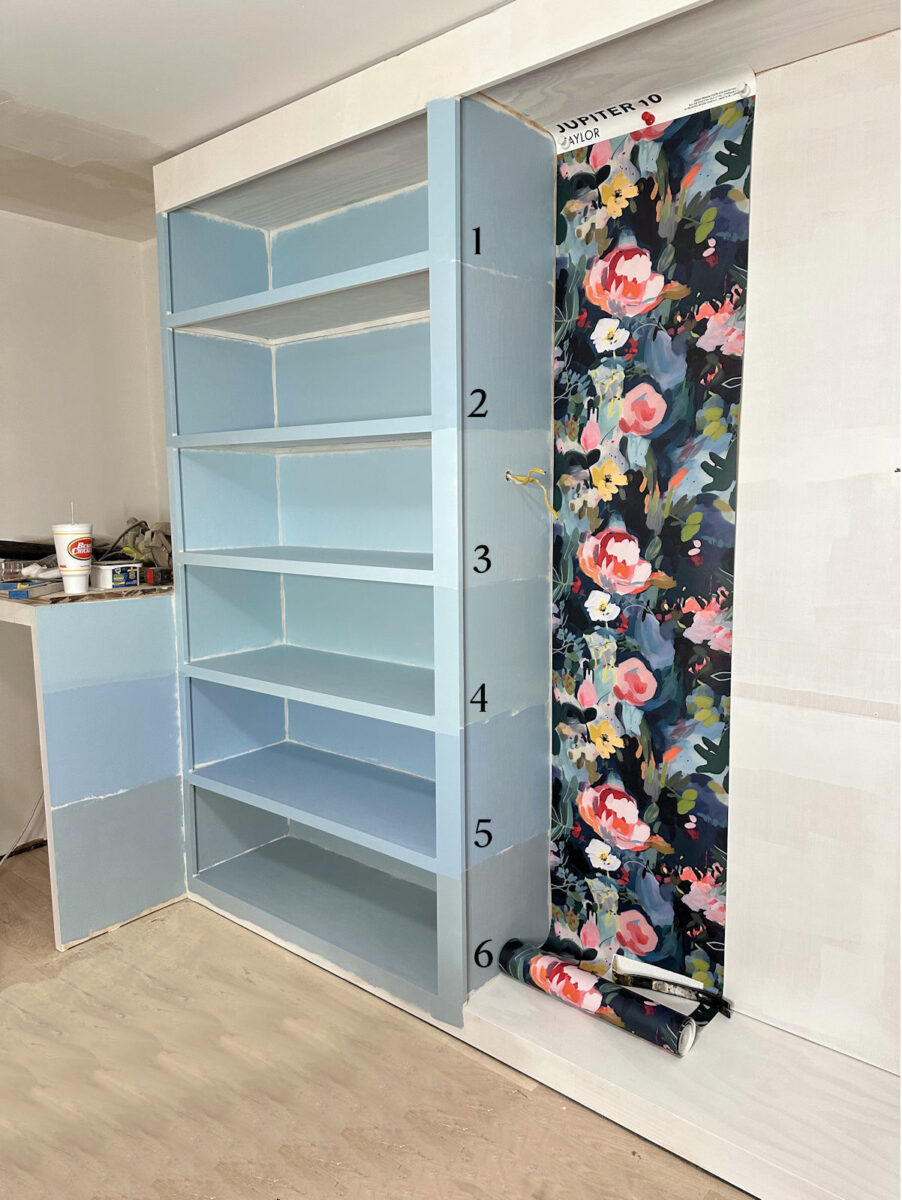
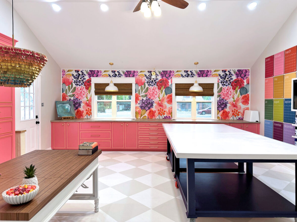
I like it better for so many reasons. First, I think blue kind of acts as a neutral, so it won’t be fighting against all of the colors in my clothes, handbags, and shoes. Also, it’s much more soothing than the coral. I do love pink and coral, but you’ll notice that throughout our house, I use them pretty sparingly as accents, with the possible exception of my studio. But even in my studio, all of that pink is surrounded by a whole lot of white and super light gray.
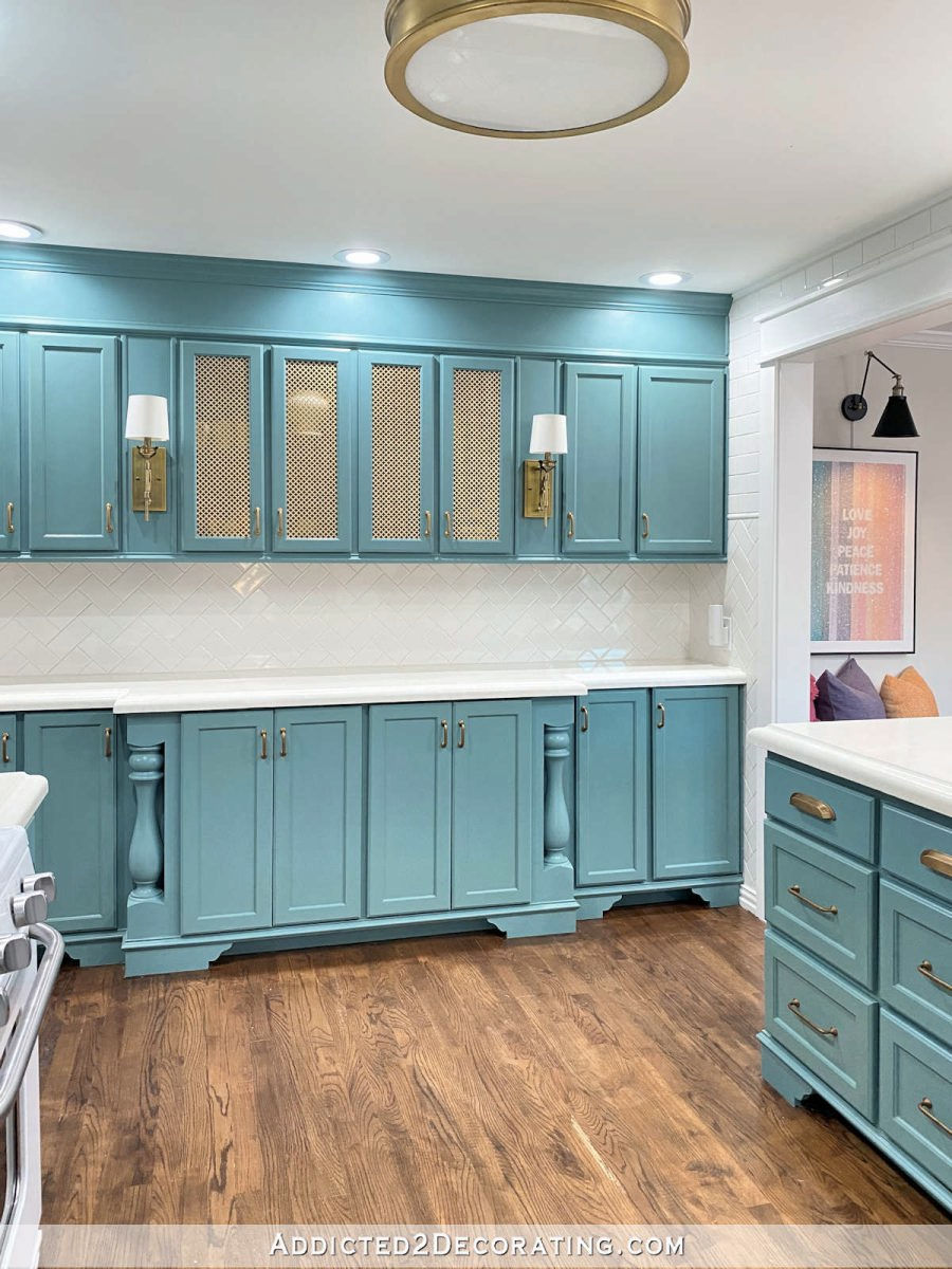
And then there’s my kitchen, which I love. It’s not quite as light as what I plan to use for the closet, but it’s not a dark teal, either.
And let’s not forget our bathroom, where I chose a very light green-blue Venetian plaster look for the walls.

So these lighter blue-green colors aren’t at all out of character for me. I also think that blue will look so much better with the lighter floors than coral. And finally, I think that blue works much better for the overall look of our master bedroom suite that I’m going for. I want that bedroom suite to be full of color, but not necessarily vibrant, jolt-in-the-arm color. I’m actually hoping that our bedroom will be more dark, moody, and bold, rather than bright, colorful, and cheerful. I mostly want it to be peaceful and soothing with accents of bright, warm colors. And I’d like the adjoining areas to complement that look.
So I now have my heart set on a light blue, but it has to have a touch of green in it. That means that I just need to keep looking until I find the right blue.
Last night as I was scrolling and scrolling, I came across a couple of Sherwin Williams colors that I want to test out. As I was scrolling for blue closets and blue rooms, I kept coming across one very popular color called Faded Flaxflower. It’s a little darker than the colors I was testing, and I think that will help to avoid that baby nursery look.
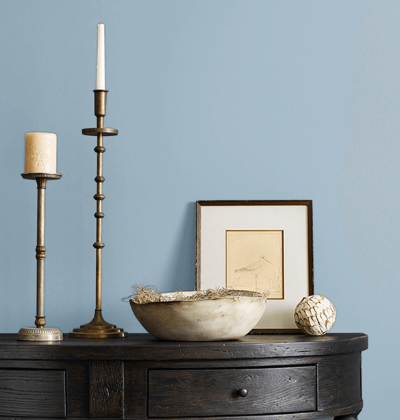
The Sherwin Williams color just a step lighter than Faded Flaxflower is called Sleepy Hollow, and it’s also a beautiful blue that doesn’t read “baby blue” to me.
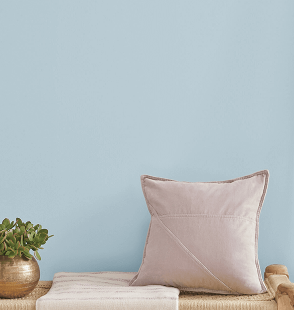
And then the next one up from that is called Moonmist.
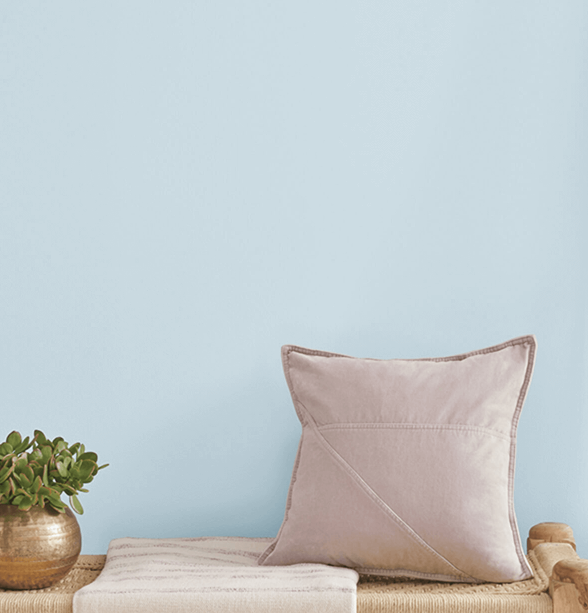
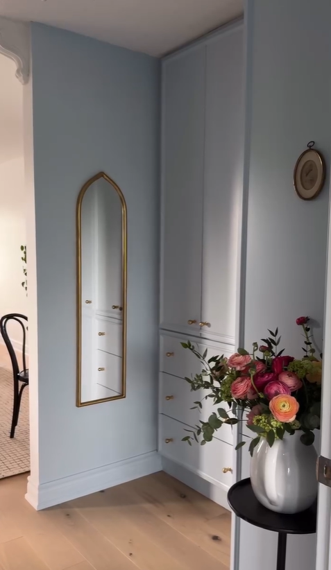
I came across a dressing room painted in that color from The Kwendy Home on Instagram. This one might actually be too light for my taste, but I was pleased to see that even that light, it still doesn’t read “baby nursery” to me.
So I’m going for blue, but the search for the perfect color is still on. I have a feeling that I’ll find the perfect blue at Sherwin Williams. And my fears of winding up with a closet that looks like a baby nursery have now been quelled. I’m also very glad that I took the time to test out corals. Had I bypassed that step, and just made myself go with blue, I would have second-guessed myself every single time I came across a picture of a beautiful pink or coral walk-in closet, wondering if I had made a mistake with my decision. But now I know that I tried them, I compared them side-by-side, and I really do genuinely prefer the blue. I can move on now. I just have to find that perfect blue now.

Addicted 2 Decorating is where I share my DIY and decorating journey as I remodel and decorate the 1948 fixer upper that my husband, Matt, and I bought in 2013. Matt has M.S. and is unable to do physical work, so I do the majority of the work on the house by myself. You can learn more about me here.